The Rhythm of Release Notes
The Rhythm of Release Notes
Jan 14, 2026

Introduction
Great product development needs a steady heartbeat. Yet, release notes are often treated as a static graveyard of ticket numbers and technical jargon. I designed a system to change that cadence.
This project is a communication architecture designed to turn sporadic engineering updates into a predictable rhythm of value. By standardizing how we documented releases—using a strict serialized format—I created a universal reference point. This framework allowed clients to feel the steady pulse of progress, while enabling internal teams to audit history and track our velocity against the Product Roadmap with precision.
Next, we will walk through a visual reconstruction of these notes. Although the specific features listed are fictionalized to protect intellectual property, the layout and hierarchy are exact replicas of the live production environment. This document appears utilitarian rather than flashy, but that was intentional; it served as a core element of our communication strategy.
The Anatomy of the Framework
1. Establishing the Anchor
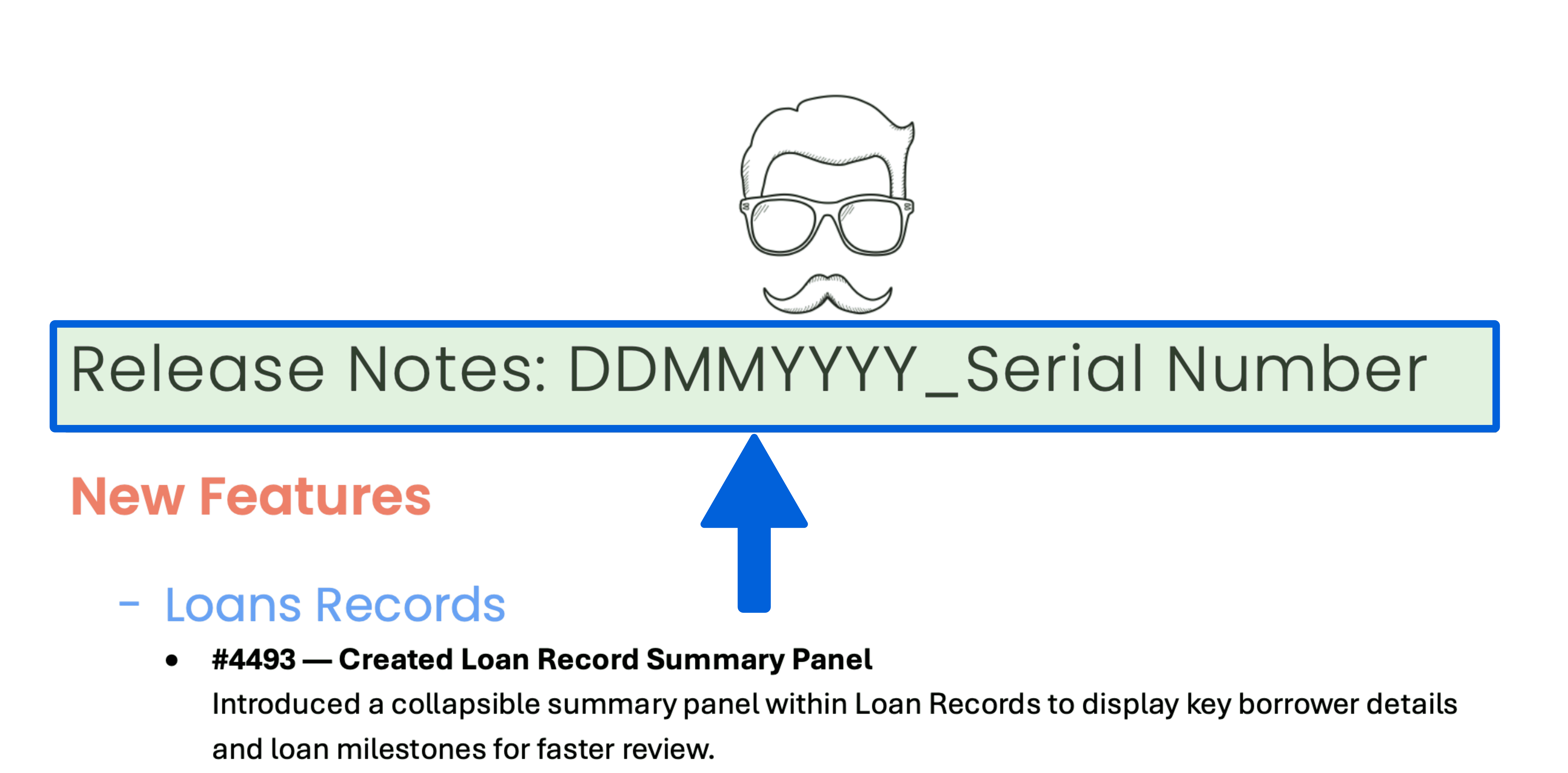
Prominently displayed at the very top of every document is our strict indexing system, formatted as DDMMYYYY_Serial Number. We placed this here to serve as a precise chronological anchor. Whether a Client Success manager is on a call or an engineer is debugging a regression, they can instantly reference this specific release cycle without ambiguity.
2. Navigation by Persona
Moving down the page, we intentionally segmented the document to prevent cognitive overload. We split updates into three distinct functional areas: New Features, Enhancements, and Bug Fixes.
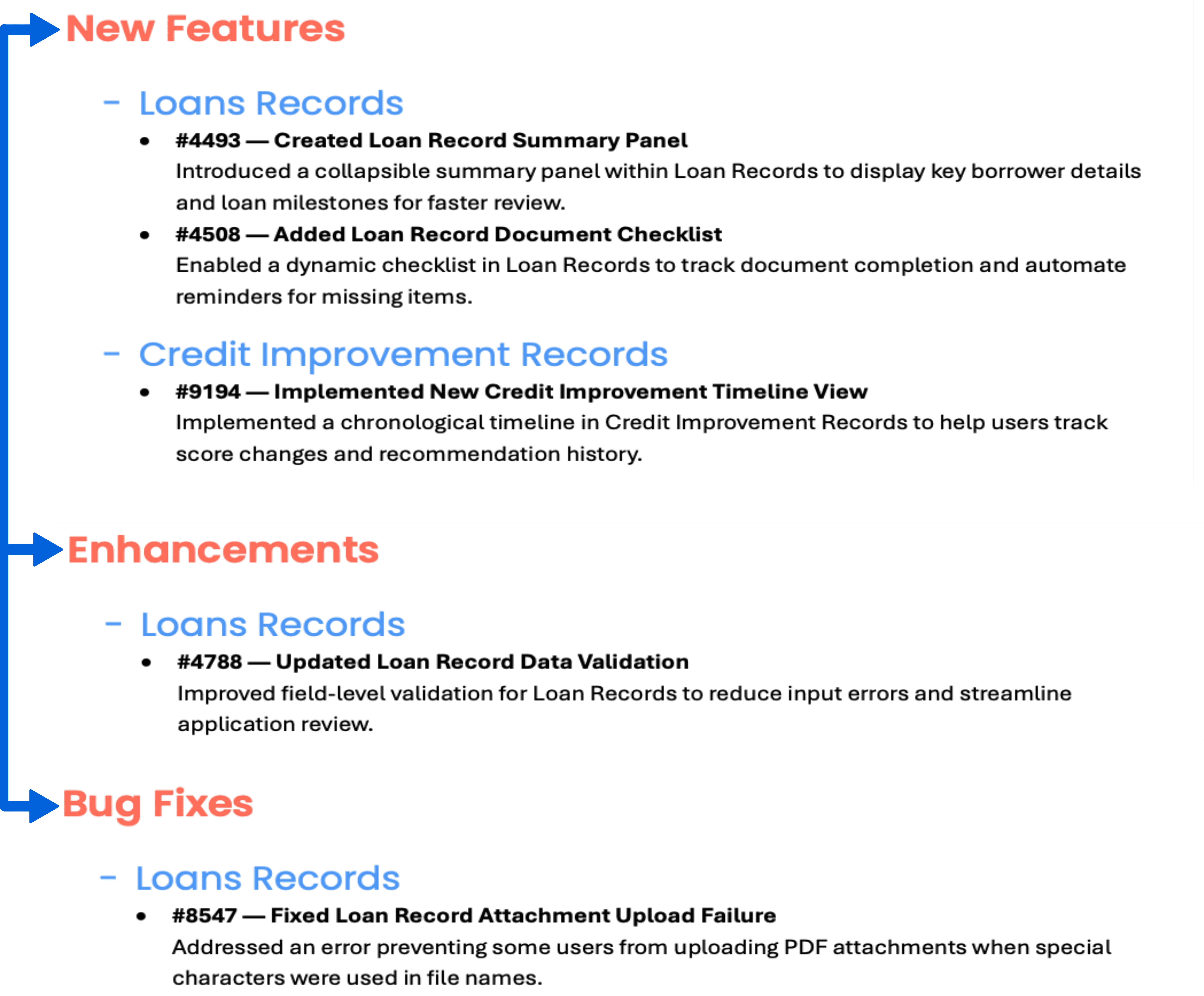
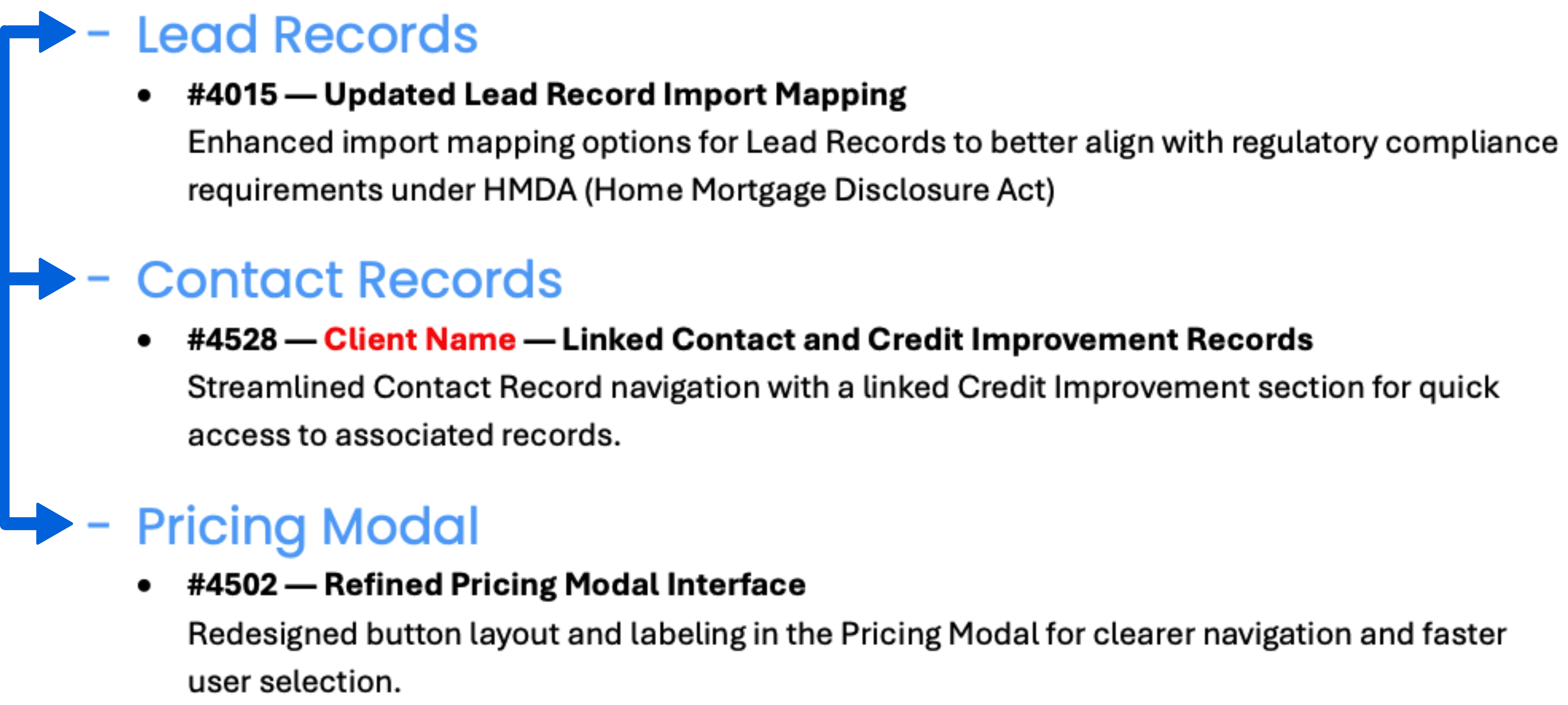
Within these high-level sections, we further grouped items by module—such as Lead Records or the Pricing Modal. This allows users to "hop" directly to the content that impacts their daily workflow:
A Loan Officer might skip straight to "Pricing Modal" changes.
An Improvement Specialist can zero in immediately on the "Credit Improvement" sub-section.
3. Traceability & Depth
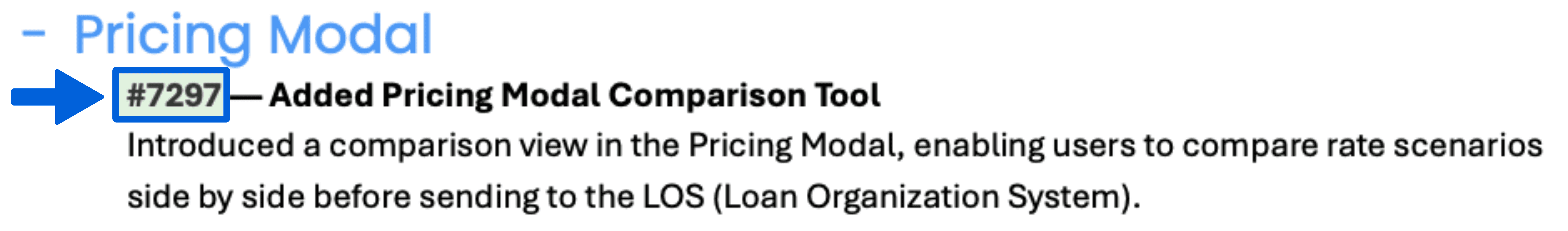
Zooming in on individual line items, every entry begins with a specific Ticket ID (e.g., #4493).
Azure Boards Integration: These numbers correspond directly to our internal engineering tickets.
Toggle Functionality: We designed a system where these IDs could be toggled as live hyperlinks for internal teams—allowing deep dives into requirements—or rendered as static text for client-facing versions to maintain security.
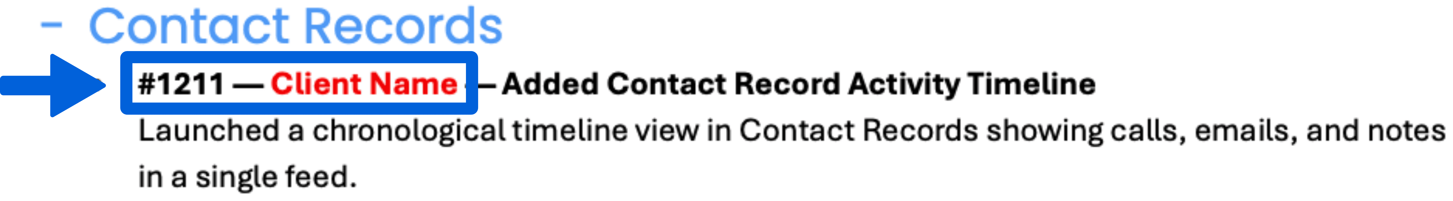
4. Client-Specific Logic
Embedded within the list, you will occasionally see a label like #1211 — Client Name. This acts as a critical signal for the Client Success team:
Presentation Logic: It alerts the CS team to remove specific notes before presenting to non-relevant clients.
Knowledge Retention: It keeps the CS team aware of all active features, even those hidden from the general public.
Confirmation: It serves as a receipt to specific partners that their requested feature has been delivered.
5. Visual Consistency
Finally, the entire document is wrapped in a "Base Style" that adheres to strict brand guidelines. From the logo placement to the standardized H1, H2, and H3 headers, every element is color-coded to match the specific product branding. This went beyond simple aesthetics—it established a unified ecosystem. Whether a client opened a release note, a user guide, or a training resource, they experienced the same "designed touch" and predictable flow, ensuring that every touchpoint felt like a seamless extension of the software itself.
Impact & Value
Ultimately, this framework transformed a routine technical requirement into a strategic asset. By treating release notes as a product in themselves, we created a single source of truth that did more than just list fixes—it visualized our momentum.
This format proved to stakeholders that even small steps were driving us consistently toward our larger Product Roadmap. It empowered clients with transparency—answering questions like "Was that lead mapping issue resolved?" by pointing to ticket #6492—while providing engineers with a mechanism to audit history. This project exemplifies my belief that effective technical communication isn't just about writing—it's about designing systems that ensure the right information reaches the right person.
Introduction
Great product development needs a steady heartbeat. Yet, release notes are often treated as a static graveyard of ticket numbers and technical jargon. I designed a system to change that cadence.
This project is a communication architecture designed to turn sporadic engineering updates into a predictable rhythm of value. By standardizing how we documented releases—using a strict serialized format—I created a universal reference point. This framework allowed clients to feel the steady pulse of progress, while enabling internal teams to audit history and track our velocity against the Product Roadmap with precision.
Next, we will walk through a visual reconstruction of these notes. Although the specific features listed are fictionalized to protect intellectual property, the layout and hierarchy are exact replicas of the live production environment. This document appears utilitarian rather than flashy, but that was intentional; it served as a core element of our communication strategy.
The Anatomy of the Framework
1. Establishing the Anchor
Prominently displayed at the very top of every document is our strict indexing system, formatted as DDMMYYYY_Serial Number. We placed this here to serve as a precise chronological anchor. Whether a Client Success manager is on a call or an engineer is debugging a regression, they can instantly reference this specific release cycle without ambiguity.
2. Navigation by Persona
Moving down the page, we intentionally segmented the document to prevent cognitive overload. We split updates into three distinct functional areas: New Features, Enhancements, and Bug Fixes.
Within these high-level sections, we further grouped items by module—such as Lead Records or the Pricing Modal. This allows users to "hop" directly to the content that impacts their daily workflow:
A Loan Officer might skip straight to "Pricing Modal" changes.
An Improvement Specialist can zero in immediately on the "Credit Improvement" sub-section.
3. Traceability & Depth
Zooming in on individual line items, every entry begins with a specific Ticket ID (e.g., #4493).
Azure Boards Integration: These numbers correspond directly to our internal engineering tickets.
Toggle Functionality: We designed a system where these IDs could be toggled as live hyperlinks for internal teams—allowing deep dives into requirements—or rendered as static text for client-facing versions to maintain security.
4. Client-Specific Logic
Embedded within the list, you will occasionally see a label like #1211 — Client Name. This acts as a critical signal for the Client Success team:
Presentation Logic: It alerts the CS team to remove specific notes before presenting to non-relevant clients.
Knowledge Retention: It keeps the CS team aware of all active features, even those hidden from the general public.
Confirmation: It serves as a receipt to specific partners that their requested feature has been delivered.
5. Visual Consistency
Finally, the entire document is wrapped in a "Base Style" that adheres to strict brand guidelines. From the logo placement to the standardized H1, H2, and H3 headers, every element is color-coded to match the specific product branding. This went beyond simple aesthetics—it established a unified ecosystem. Whether a client opened a release note, a user guide, or a training resource, they experienced the same "designed touch" and predictable flow, ensuring that every touchpoint felt like a seamless extension of the software itself.
Impact & Value
Ultimately, this framework transformed a routine technical requirement into a strategic asset. By treating release notes as a product in themselves, we created a single source of truth that did more than just list fixes—it visualized our momentum.
This format proved to stakeholders that even small steps were driving us consistently toward our larger Product Roadmap. It empowered clients with transparency—answering questions like "Was that lead mapping issue resolved?" by pointing to ticket #6492—while providing engineers with a mechanism to audit history. This project exemplifies my belief that effective technical communication isn't just about writing—it's about designing systems that ensure the right information reaches the right person.