Benefits Beyond the Kite
Benefits Beyond the Kite
Jan 15, 2026

The Assignment
I was tasked with a mock project to reimagine the company’s benefits guide. The goal was to take a functional, standard document and elevate it to match the company’s new, dynamic visual identity.
The existing guide followed a traditional format that most employees would recognize: static blocks of text paired with standard stock imagery, like the classic "parent with their kid flying a kite." It was clear and functional, but it felt separate from the company's evolving brand. I looked to their recently launched product video for inspiration—which featured a fluid mix of organic line drawings and soft watercolor textures—and set out to adapt that same energy into a PowerPoint presentation.
The Visual Translation
1. Forensics & Consistency
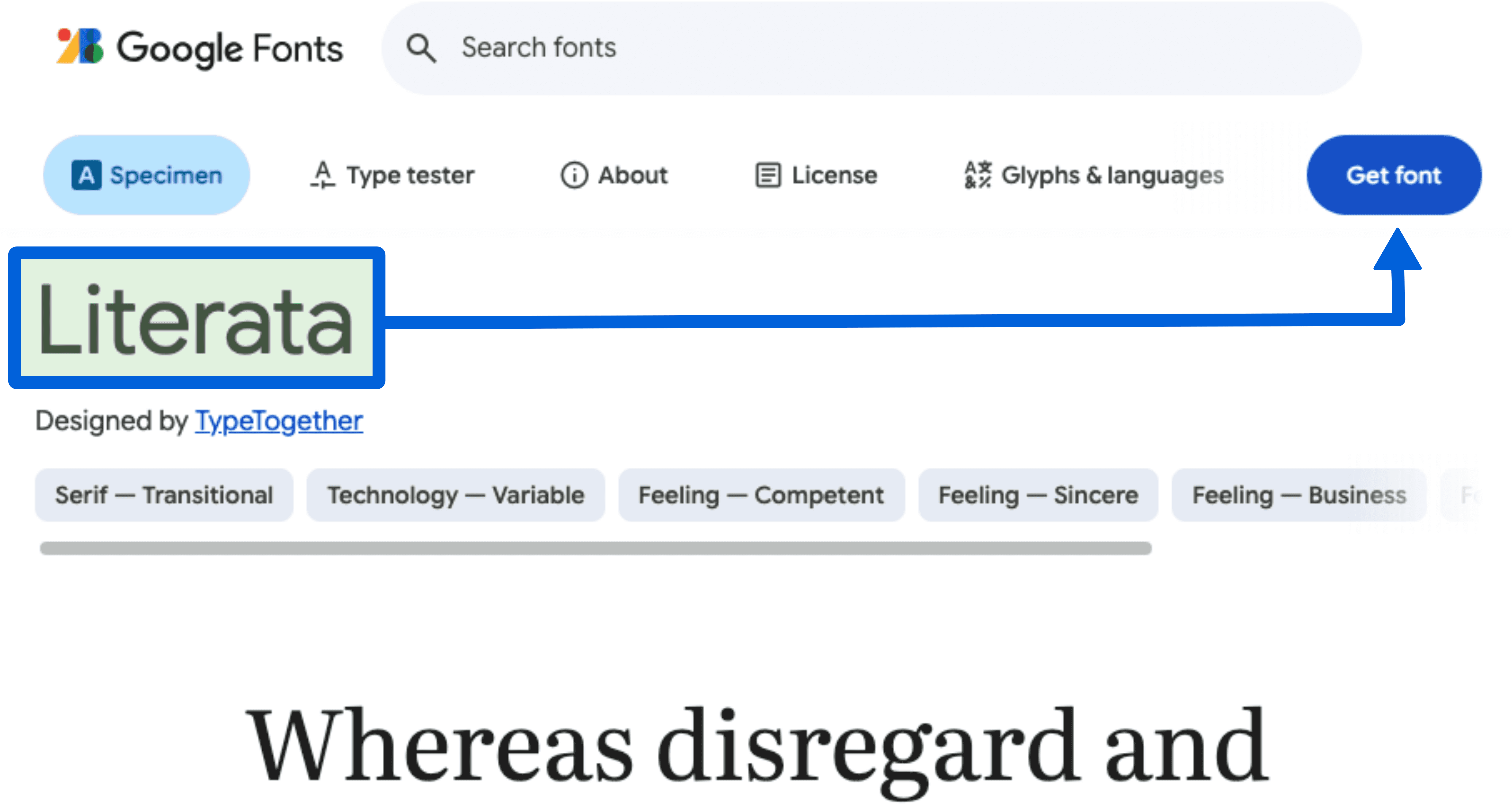
To ensure the guide didn't just look "similar" but felt like a native part of the brand family, I started by gathering the exact DNA of their design. I used browser inspection tools on their landing pages to pinpoint the precise Google Font families and extracted the specific hex codes to recreate their watercolor palette. I also sourced illustrations from the same asset library they utilized—finding matching characters, such as the figure holding a book—to ensure the visual language remained consistent.
2. Motion as a Guide
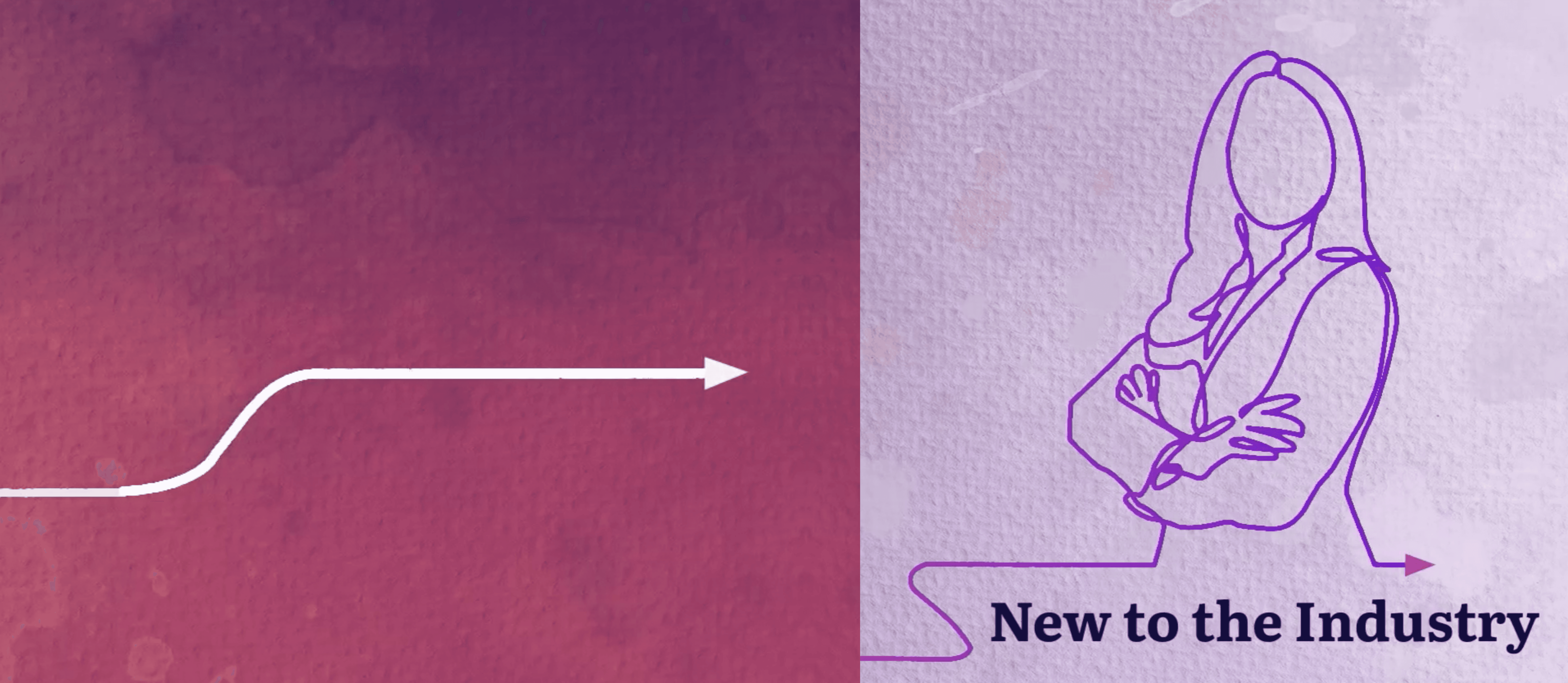
I wanted to break the feeling of simply "clicking next" through a slide deck. To do this, I introduced a hand-drawn arrow motif that acted as a visual tour guide:
The Sketch: Using a Wipe effect, I animated the arrow so it appeared to be sketched onto the screen in real-time, drawing the eye from the bottom of the page upward.
The Push: I synchronized this with a Push transition. As the arrow "finished" drawing itself at the top edge, the entire slide would push upward. This created a tactile illusion: it felt as if the arrow was physically engaging with the slide, pulling the next section into view like a continuous scroll.

Note: For this showcase, I have replaced the original client logo with my own personal branding
3. Solving for DensityA common challenge in benefits guides is managing long lists of coverage details without cluttering the page. I solved this by utilizing the Morph transition to create a "scrolling" effect. By duplicating the slide and shifting the text block upward while keeping the watercolor background locked in place, I allowed the viewer to read through detailed bullet points smoothly. It kept the information accessible without breaking the visual peace of the design.

Retrospective
The client was delighted with the outcome, mentioning it effectively connected a typical HR document with their fresh, contemporary brand voice. Reflecting on the process, I recognize areas for technical improvement. In this version, I used the standard Wipe effect to imitate line drawing, which works but feels somewhat linear. If I were to redo this now, I would incorporate SVG drawing transitions, similar to those in my current portfolio's motion assets. Utilizing SVGs with layer clipping would enable a genuine, organic path animation that follows the line's curves, adding a polished touch that the Wipe effect lacks.
The Assignment
I was tasked with a mock project to reimagine the company’s benefits guide. The goal was to take a functional, standard document and elevate it to match the company’s new, dynamic visual identity.
The existing guide followed a traditional format that most employees would recognize: static blocks of text paired with standard stock imagery, like the classic "parent with their kid flying a kite." It was clear and functional, but it felt separate from the company's evolving brand. I looked to their recently launched product video for inspiration—which featured a fluid mix of organic line drawings and soft watercolor textures—and set out to adapt that same energy into a PowerPoint presentation.
The Visual Translation
1. Forensics & Consistency
To ensure the guide didn't just look "similar" but felt like a native part of the brand family, I started by gathering the exact DNA of their design. I used browser inspection tools on their landing pages to pinpoint the precise Google Font families and extracted the specific hex codes to recreate their watercolor palette. I also sourced illustrations from the same asset library they utilized—finding matching characters, such as the figure holding a book—to ensure the visual language remained consistent.
2. Motion as a Guide
I wanted to break the feeling of simply "clicking next" through a slide deck. To do this, I introduced a hand-drawn arrow motif that acted as a visual tour guide:
The Sketch: Using a Wipe effect, I animated the arrow so it appeared to be sketched onto the screen in real-time, drawing the eye from the bottom of the page upward.
The Push: I synchronized this with a Push transition. As the arrow "finished" drawing itself at the top edge, the entire slide would push upward. This created a tactile illusion: it felt as if the arrow was physically engaging with the slide, pulling the next section into view like a continuous scroll.
Note: For this showcase, I have replaced the original client logo with my own personal branding
3. Solving for DensityA common challenge in benefits guides is managing long lists of coverage details without cluttering the page. I solved this by utilizing the Morph transition to create a "scrolling" effect. By duplicating the slide and shifting the text block upward while keeping the watercolor background locked in place, I allowed the viewer to read through detailed bullet points smoothly. It kept the information accessible without breaking the visual peace of the design.
Retrospective
The client was delighted with the outcome, mentioning it effectively connected a typical HR document with their fresh, contemporary brand voice. Reflecting on the process, I recognize areas for technical improvement. In this version, I used the standard Wipe effect to imitate line drawing, which works but feels somewhat linear. If I were to redo this now, I would incorporate SVG drawing transitions, similar to those in my current portfolio's motion assets. Utilizing SVGs with layer clipping would enable a genuine, organic path animation that follows the line's curves, adding a polished touch that the Wipe effect lacks.